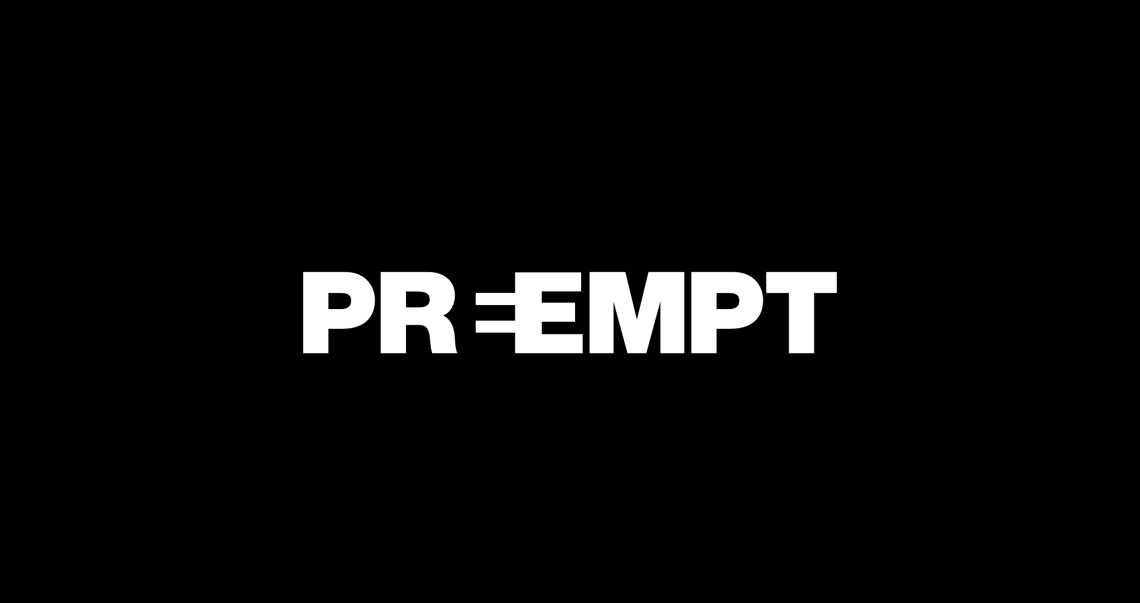
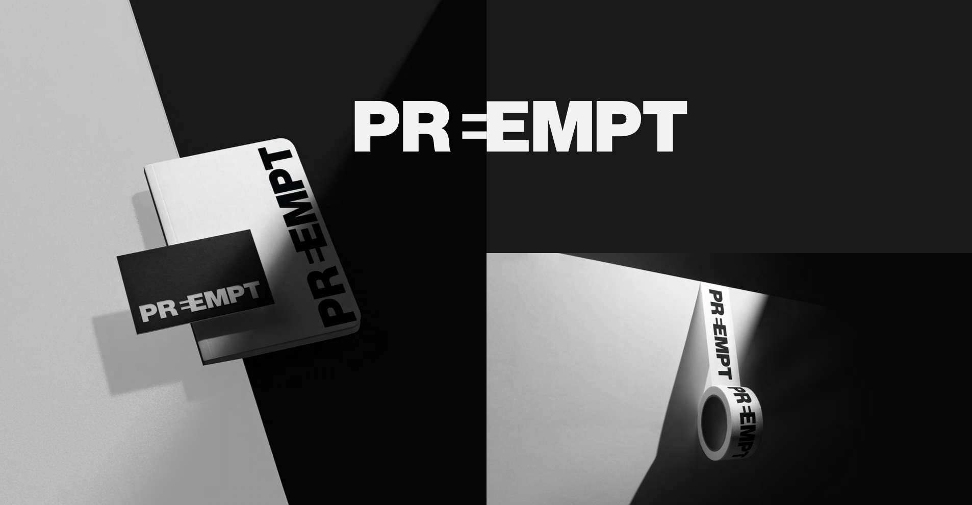
PREEMPT
Brand Development
This brand needed to be bold without being shouty. The client came to us with the challenge to create a brand for an out-of-the-box insurance company that protects high-profile individuals against public scandals in an almost “overnight” approach.
Under the concept of “Hidden Forms” we applied a “simplistic without being understated” approach paying attention to the counter-space of various typographic forms. The black and white, sans-serif design is bold and robust, while having an element of playfulness through the creation of an icon that is intrinsic to the new brand.


Role: Brand Design Lead
Project developed at THEM